This is the 6th post from the Data Manipulations with PowerShell series, where we are diving into the specific phase of data operations processes and apply/use PowerShell along the way.
Previous posts:
- Empower your Data Retrieval with PowerShell
- Make your Data Processing more efficient with PowerShell
- Data Transformation Made Easy with PowerShell – Part 1, Part 2
- PowerShell for Data Analysis: A Practical Guide to Extracting Insights from Your Data

The main goal of this phase is the graphical representation of data to showcase patterns, insights and trends that may not be immediately recognizable when looking at raw data.
Visual representation and specifically stuff related to colors and presentations is pretty subjective. I am not considering myself as subject matter expert in this area and if to be honest, I am one of “color challenged” person.
Let’s review 3 main pillars of Data Visualization.
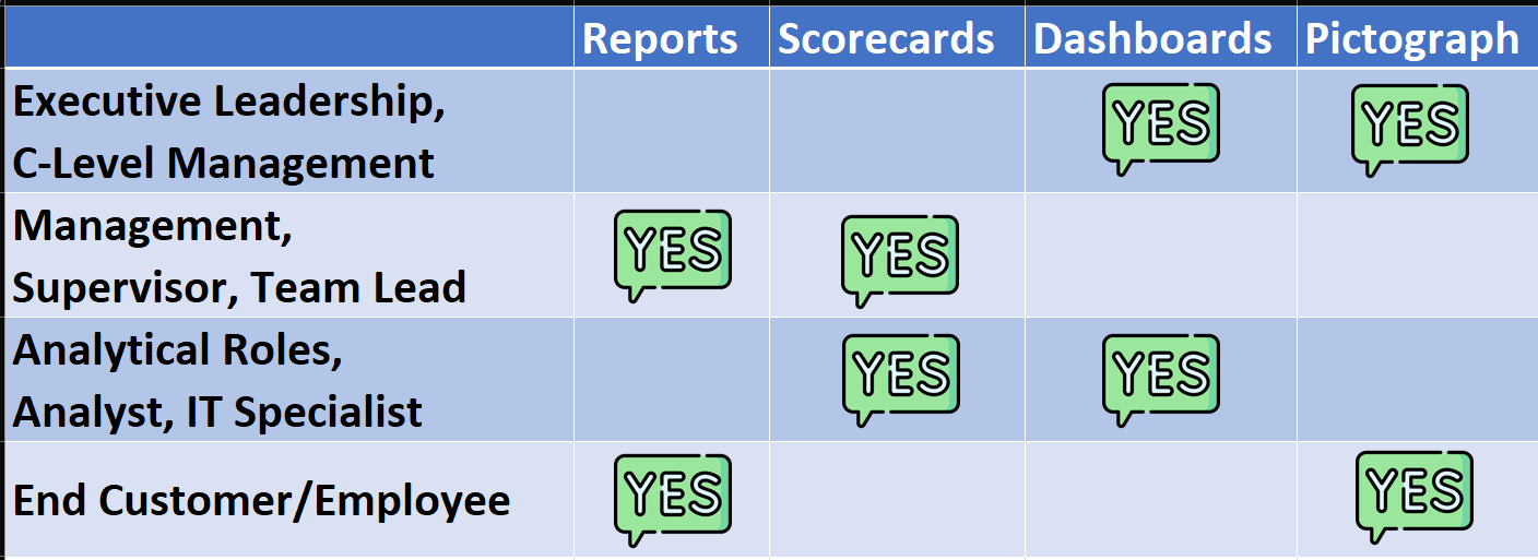
WHO?
Who is the target audience/main consumers of the visualization materials. Different types of people consume data in contrasting ways primarily driven by their attention span and brain wiring.
Here some guidance or “rule of thumb”:
WHAT?
What message are we trying to convey. Based on the Data Analysis, we understand what the results are and what does data tells us. We know what the essence of our dataset is and what we need to showcase ( data relationships, comparisons, distributions etc.). The gist here is the main deliverable of Data Analysis phase.
HOW?
There are well known set of visuals for the specific use cases:

But it is not just about presenting data. If the consumer looks at the visuals and still require someone to walk him or her through or still asks “So, what?” that means that visualization is not good enough. You have to tell a story though data. Effective data visualization helps narrate a clear and compelling story, enabling the audience to grasp the message and understand the context behind the data.
Also think about the colors that you are going to use. Colors can be used to emphasize and focus on some specific items and “scream” the important information.
There are 3 main types of the Color Palettes:
- Triadic – formed by selecting three colors that are evenly spaced on the color wheel. This creates a vibrant and dynamic combination of colors.
- Monochromatic – using different shades, tones, and tints of a single base color. It involves taking one color and adding white to create tints, black to create shades, and gray to create tones.
- Analogous – colors that are located next to each other on the color wheel. These colors share a similar hue and create a smooth and unified appearance.

Here are few “rule(s) of thumb):
- Human eye can only differentiate up to 5 colors of the same hue
- Use 3-5 colors max on a single visual
- Use semantic meaning for the colors (green – good, red – bad)
Out of the Box
PowerShell itself doesn’t have native/built-in data visualization capabilities like specialized tools or libraries. Although, creative members of PowerShell Community have couple of options for us. Let’s examine our possibilities.
Community Provided
Modules with *plot* and *visual*
I would like to highlight few of them. Because there was nothing for us to unwrap in the “Out of the Box” section, we will spend few moments and review some examples for each module.
Statistics
- Statistics by Nicholas Dille – statistical analysis of data in the console window. For example this module can generate a histogram (Get-Histogram) and visualize it (Add-Bar).
Example

$Dataset4 | Select-Object -First 3 | Format-Table
$Dataset4 | Group-Object -Property Age
Get-Histogram -Property Age -BucketWidth 6 -Data $Dataset4 | add-bar
Graphical
- Graphical by Prateek Singh – Consumes data points as input and plots them on a 2D graph in the Powershell console.
Example

$Dataset4 | Select-Object -First 3 | Format-Table
$Dataset4 | Group-Object -Property Age | Select-Object Name,Count  | Sort-Object -Property Count -Descending
Show-Graph -Datapoints $($Dataset4| %{[int]$($_.DOB.split('/')[-1])} ) -GraphTitle "DataSet4 - Age" -XAxisStep 6
Summary
Although there is no “out of the box” capabilities but the native .NET and creative spirit from the community eliminates/workarounds any limitations. And even with limited capabilities and functionality, we can use PowerShell to visualize the data even in the console.
Next: Data Export with PowerShell: Best Practices and Advanced Techniques.
Reference
- How to Design Visually Stunning Power BI Reports
- Choosing a good chart
- Choose your Power BI chart
- Power BI visualization best practices
Data icons created by Freepik – Flaticon.
Thanks a lot for reading.